
Overview
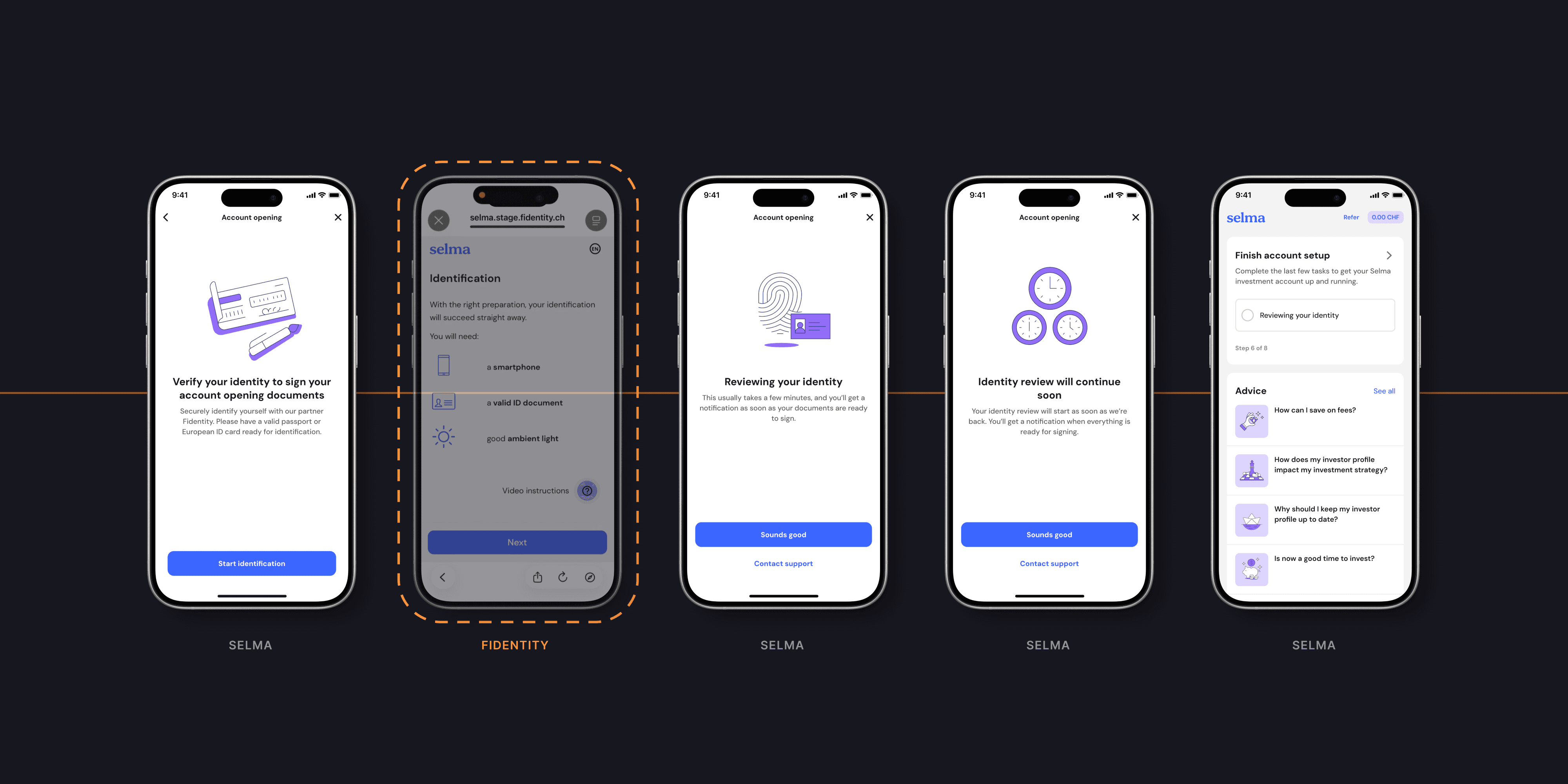
How do you redesign a step that happens in someone else's product? Opening a Selma account ends with proving who you are. That used to mean IDnow: a second app and a video call with an agent. In a two-week design sprint I designed everything around Fidentity, an identity check that opens right from our app: the way in, the way back and every wait in between. About a quarter more of the people who start the check now get through it.
How do you redesign a step that happens in someone else's product? Opening a Selma account ends with proving who you are. That used to mean IDnow: a second app and a video call with an agent. In a two-week design sprint I designed everything around Fidentity, an identity check that opens right from our app: the way in, the way back and every wait in between. About a quarter more of the people who start the check now get through it.
CLIENT
Selma Finance
YEAR
2025
DELIVERABLES
Edge cases & flows UX copy UI design Prototype
ROLE
Product designer & project lead
01 — The problem
The last step was the biggest leak in onboarding
To finish opening an account, people had to leave Selma: download the IDnow app, copy an Ident-ID code, then wait for a video call with an agent, Monday to Saturday, 7:00–22:00. Close to half of the people who started the check never got through it.


02 — What people told us
People weren't failing the check. The check was failing them.
Customer feedback kept telling the same story: long waits, agents who didn't show up, and people trying again and again.
“Hi! I’ve tried identifying myself 7 times today with ID NOW and no one is ”showing up” to do the identification”
— a potential client, via customer support
“Client has now tried 6 times over 3 weeks to complete the verification with IDnow.”
— a Customer Success note
03 — The turning point
We couldn't change their screens, so I designed everything around them
Fidentity lets people scan their ID, take a selfie and sign their documents in a web flow that opens from our app, without waiting for an agent. But those screens belong to Fidentity, and we couldn't redesign them. What we could design was the way in, the way back and every wait in between.
So the question became: how might we make a step we don't own feel like part of Selma?


04 — Constraints
Three rules we designed within
Their screens, our flow — Fidentity's screens can't be changed, only what comes before and after.
Two providers at once — IDnow stayed live as a backup at the start, so nothing could break the old flow.
People don't finish in one go — they leave halfway, come back two weeks later, or finish at night, when no one can review their ID until morning.
05 — The solution
So the app now always tells you what happens next
One bridge screen sets expectations: “Verify your identity to sign your account opening documents”, with a reminder to have a valid passport or European ID card ready. After Fidentity, people land back in Selma on a screen that fits the moment: “Reviewing your identity” during business hours, “Identity review will continue soon” at night. The home checklist shows the same state, so anyone who leaves can see where they are.


06 — Key decisions
Four decisions did most of the work
Design every exit, not just the happy path — I mapped what happens when people leave during business hours, outside them, after an error, or two weeks later, and gave each one its own screen.
Say who's waiting on whom — every waiting screen says what's happening, how long it usually takes, and that a notification will follow.
Two kinds of error — “Identification failed 😕” offers a retry; “A quick manual check is needed” sends people to support, without making it their fault.
Keep a way back — a switch between IDnow and Fidentity meant we could roll back if drop-off spiked.


07 — Impact
About a quarter more people get through
After the switch, about a quarter more of the people who started the identity check got through it, and more of them went on to sign their documents. That's still short of what we bet on. To be fair: the investment plan from part two launched the same week, though it changes an earlier step.
What I'd take with me: when you can't design the core screens, design the seams. Most of the risk lives in the moments between two products. Next time I'd agree on one success metric before launch, so we're not piecing it together from two providers' events afterwards.
What happened next: a month after the switch, the notification prompt moved to right after the check, where updates actually matter.
Exact figures are confidential. Amounts in screenshots are examples. Reach out for the full story.


Other projects

